Resu.Me

Interface Design
User Research
User Testing
Career Tech
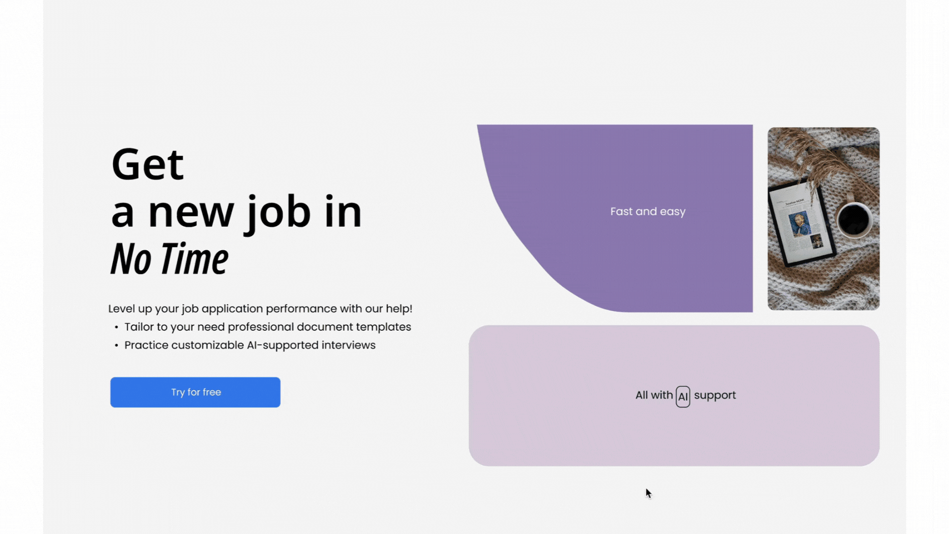
A Document Builder Web App designed to improve users' job market competitiveness by helping them create professional, tailored resumes and cover letters.

Duration: February 2025 - Present
Role: UI/UX Designer
Industry: Career Tech
Tools: Figma, Figjam, ClickUp
About
What is the ResuMe App?
This is a Career Tech web application designed to help users build and refine their professional image through intuitive, editable resume and cover letter templates.
The platform provides a guided, error-proof editing experience, enabling anyone to create polished application documents with ease.
AI supports its features that review the user’s input and suggest real-time improvements, ensuring clarity, tone, and professionalism.
The product is tailored for a general audience, prioritising accessibility, confidence, and usability at every step of the job application journey.

Led end-to-end project development, from strategic planning to design delivery.
Design Process
What steps did I take?

How might we help people of all ages and tech experience efficiently and confidently build job application documents to enhance their chances in the job market?
Many individuals struggle with the job application journey, often feeling lost and confused while creating professional resumes and cover letters. In the absence of clear guidance and structure, they find it difficult to present themselves effectively in the job market.
Problem
My goal is to build a cohersive, efficient and professional experience that ensures clarity of information, constructive feedback and relevant guidance throughout the process of preparing documents for the job application.
Solution
Research & Comparison
1
Product Catalogue and Preview
Enlarged full preview of template - An interactive design that enables users to explore content in greater detail through features such as zooming, scrolling, and focused inspection.
Descriptive tags and filters - Provide quick context and improve navigation.

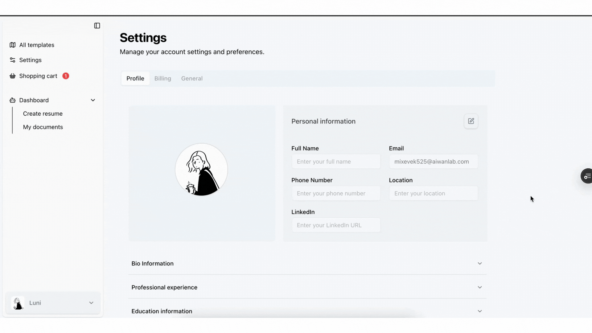
Profile Building
A personalised and clearly categorised interface that helps users create their profile step by step.
Collapsible profile sections for a more tailored and understandable view
The Dashboard
A personalised welcome section that combines quick-start functionality with a clear call-to-action for exploring premium features.
A collapsible document preview section that prioritises efficiency by showing recent items with the option to expand and view the full list."
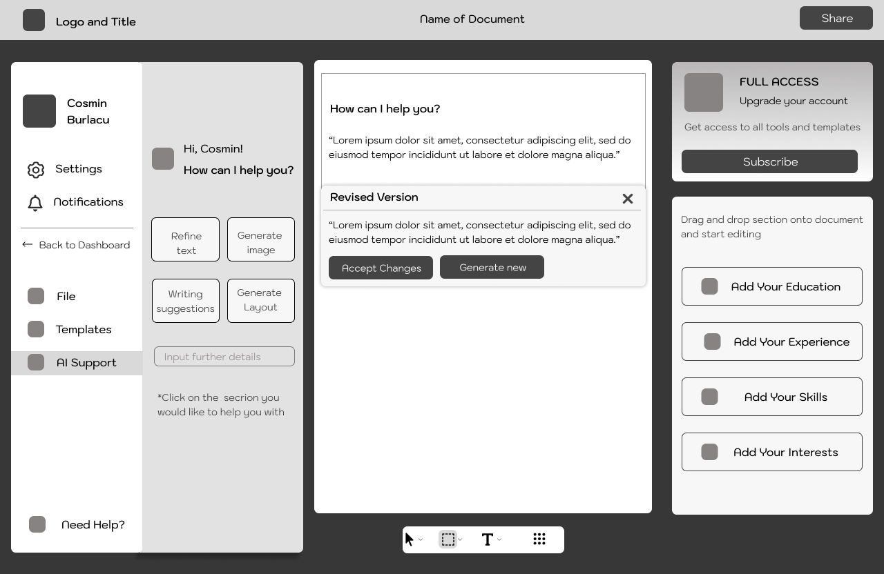
Document Building and AI Features
Pre-established templates adapt in real time to edits and data input from the user
AI-Powered guidance that offers grammar corrections, phrasing enhancements and further tone suggestions
User Flow
2
Mapping a clear view of the main desired functionalities of the app and their interconnections
Creating the flow from the initial visit on the Landing Page, setting up an account, to building professional documents using our premium features.

Wireframes
3

An overview of all and most recent documents
“Create new document” call-to action at the top
Easy access to premium features
Documents/ Dashboard

Easy access to various templates within our app through filters, while visualising your pre-purchased items
Cluttered and confusing to combine the purchased items and the marketplace on one page.
Templates Page

Modular structure for easy scanning of content
Collapsible input sections for an uncluttered view, as well as reduced user error likelihood.
Profile page
Modular structure with clear categorisation of content.
Document sections that can be edited in the right side menu for an error-proof experience
Real-time update of the document after each saved edit.
AI-Support panel for potential grammar corrections as well as language enhancements.
DOCUMENT-BUILDER PAGE
Initial Testing and Iterations


The design was confusing, particularly due to the information sections on the right, which lacked clear guidance on how to interact with or complete them.
This hurt the overall user experience.

To address this, I relocated the right-hand section and restructured it so that each part stores saved information within collapsible dropdowns.
When users need to add or edit information, a dedicated pop-up appears with clearly defined input fields tailored to the specific data type.
The layout felt crowded and visually overwhelming due to the amount of information displayed at once. The welcome banner was redundant and repetitive.
Additionally, the dedicated "Your Templates" section was unnecessary.

In the updated version, templates that have already been purchased are simply marked with a tag, creating a cleaner and more streamlined interface.

High Fidelity Design
4
Web Version


Interactivity


Style Guide
Typography

Colour Palette

Final Thoughts

My Learnings
Enhancing my communication skills:
Developed the confidence to initiate and lead meetings, in which I clearly present my design developments and further discuss project expansions.

Improving My Time and Project Management:
Experimenting with the SCRUM weekly cycles to organize and plan my workflow simultaneously with the client. This method offered transparency and helped me build awareness of priorities following the client’s needs.
